Website redesign
Role
UX Designer
Company
AND Digital
Year
2022
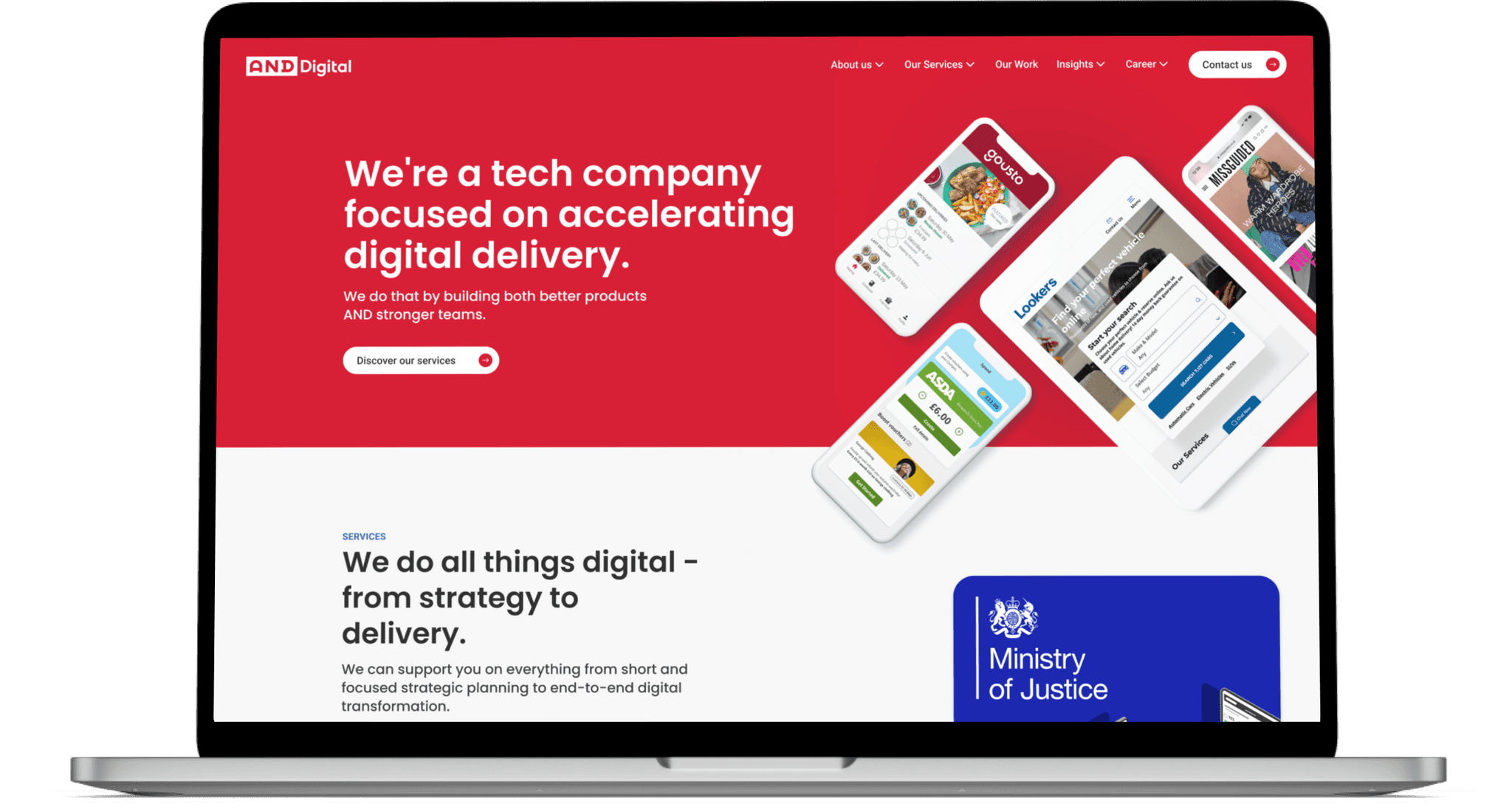
With the Manchester office having already done some design work when creating internal webpages, the AND Marketing Team approached us to rebuild the company website rather than outsource it.
The aim of the project was to rework the modules that make up the website to get them inline with other internal existing design work. One of the key requirements was to make page-building as easy as possible for the Marketing and Events Teams, using the existing drag-and-drop of the CMS.
Design System
Following Brad Frost's Atomic Design, the file consists of all the components used in the main page designs, all built from smaller parts like buttons, text blocks, dividers, input fields, and tags.
We did have an issue early on in the first phase for colours, as the brand colours for AND are bright and vibrant, but not necessarily accessible. After discussion with the Marketing team, we were able to come up with four darker, more accessible shades that are used primarily for hover states.
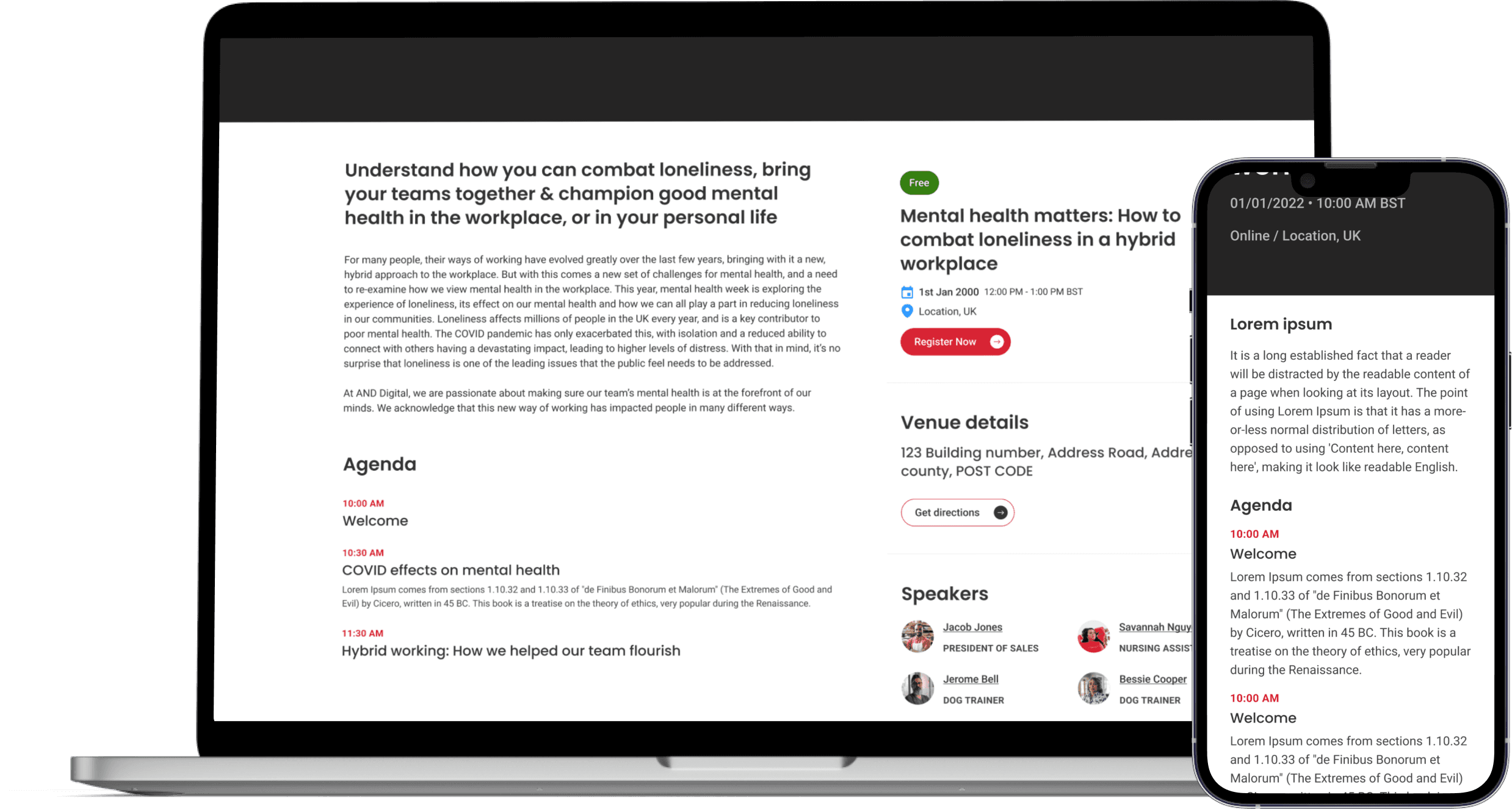
Linked content is displayed in cards, whether it's a blog post, job listing, or event. There are variations of them for the different uses, but they all follow the same structure, border radius, hover and shadow effects.
Once we started on the card components, I also created "utility components" like the yellow post-it note in the top left corner for making notes for both designers and developers to be aware of.
With variants and instance switching, we were able to build some of our larger components in a similar way to development. This then also made for easier handoffs.
The example here is of our "3 Card Block" master component where each of the cards present can be switched to another card - even when using an instance of this for the main page designs.
Website Designs
Building For Mobile
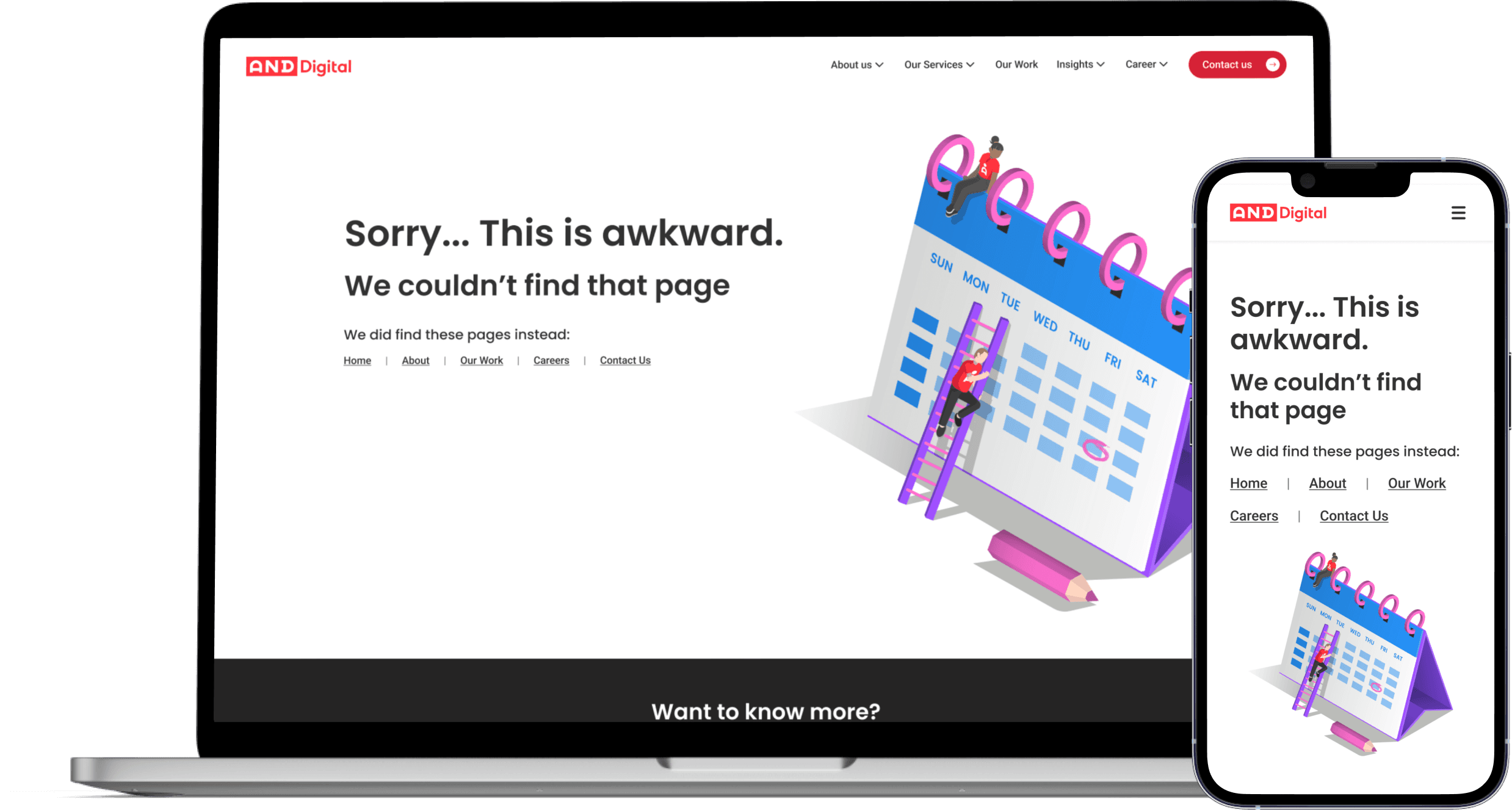
Every component has a mobile variant making use of mobile font sizing. As a team we made the decision to create a master mobile page that showed how all the components were supposed to sit in the page. Specific pages did get mobile designs to show the flow when screen sizes change. Not all mobile pages were built fully as other pages had components that would be repeated. This was mostly due to developers not needing that information since the Marketing Team would pick and mix modules from Hubspot.
Development
Tickets
For this project, Jira was our backlog management tool of choice. Each module was separated into two linked tickets - one for development, and the other for design. This allowed us to track the tasks asynchronously, and also meant that when a design ticket was completed, developers could still access it. I found the best way of working was to contact my UX Lead, or sometimes the Marketing Team, when work was ready for feedback, and once approved, screenshots and Figma links were added as comments to the tickets.
QA of Built Modules
The fastest way for the team to QA the UX of modules built was actually for us to use Slack to get the feedback across. Sometimes it would be a call to see how something is working. Other times, I would take screenshots from live previews to point out areas that needed tweaking. Knowledge of HTML and CSS proved helpful as I could give suggestions to the developers when things weren't always working, since I understood the code.
Key Takeaways
Knowledge of Code
Having knowledge of code has made me feel like I can have more meaningful discussions with the team's developers. It has also meant that during screen-sharing, troubleshooting, or QA-ing, I'm able to help find the problem, or suggest solutions, and therefore be more involved in the overall project.
Design Systems
Much like a basic knowledge of code, I am a strong advocate for design systems of some variety. Working on both the website and the design system for the website from the ground up, as a team, we found the best way to utilise our strengths as UX designers was for me to take designs built for the website and convert them into reusable components. A lot of this involved cleaning up layer structures and using Figma's interactive components for different states.
During the second phase, the strengths of our design system really shone. I was able to design pages faster since most components could be duplicated and tweaked to fit new variations. It meant that while experimenting with layouts the work sent to Marketing could be actual designs rather than wireframes as designs were easier for them to understand than blank boxes in wireframes.
Still curious?
There’s plenty more to check out


